Colour theory as a psychological principle explains how colours are understood by people. It works from the premise that colour influences perception and human behaviour because we have existing connections to them; for instance,
blue means ‘cold’ and green means ‘go’.
We make these associations because our brains are responsible for interpreting what we see and giving meaning to it — not our eyes. This is also why culture, for instance, can cause these connections to vary from country to country.
Brands use colour psychology in their merchandise, logos and marketing communications to convey what they stand for, to gain their target audience’s attention and to make themselves recognisable.
In your marketing efforts, you will want to choose colours that align with the emotion you want to elicit, so you need to look at the meaning connected to the colour, as well as the effect it has on a person’s
physiology. Your decision should also be shaped by the industry you are in.
Here,
media update’s Maryna Steyn looks at the meaning of colours to consider in your marketing.
RED
Often used by fast food chains, red is the favoured colour as it stimulates appetite. Media brands use it to encourage action.
Red is a favourite because it captures attention and causes your pulse to quicken. That is why people feel compelled to respond when presented with this colour. If we see red, we want to eat more and
faster.
Some of the meanings connected to this colour include
love,
passion,
joy,
urgency,
energy and
hospitality. Examples of brands that use red in their marketing materials are KFC and Coca-Cola.
 © Coca-Cola India
BLUE
Tech companies employ the colour blue to convey
trust or
quality. This is because it creates a soothing mood and evokes loyalty, which, in turn, leads to returning customers.
Other meanings connected to blue include
stability,
harmony,
honesty,
health,
calmness and
relaxation. It is easy to understand why brands such as Dell and Facebook include blue in their marketing materials because it denotes that their product or service is of the highest quality.
 *Image sourced from This Week In Startups
GREEN
The most prominent colour in
nature, this is used as a status symbol to attract outdoor enthusiasts and indicate new products. Brands such as John Deere use green to signify what their sphere of business is. A financial institution such as Nedbank uses it as the colour that denotes money.
On a primal level, green is a reassuring colour as it infers being alive or relaxed. It also has meanings of
health,
freshness,
fertility,
growth,
adventure and
wellness connected to it.
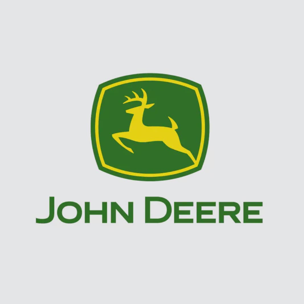 © John Deere
YELLOW
Yellow is used to grab a shopper's attention and encourage communication.
An interesting fact about this colour is that it boosts mental activity and generates muscle growth.
It is no surprise that the meanings connected to it include cheerfulness, positivity, playfulness, confidence and optimism.
Brands that use this colour are focussed on looking at the bright side of life, such as Nikon or Lays — what is a get together without a bag of chips and some happy snaps?
 *Image sourced from Seek Logo
PURPLE
This colour is used to signify
luxury,
exclusiveness and
sophistication. This is because purple evokes self-awareness and spiritual reflection. For instance, a brand such as Hollard sells funeral cover and the use of purple is a good choice because it evokes self-consciousness.
Another meaning that is connected to it as well includes
spirituality, creativity, nobility, inspiration, success and nostalgia. Examples of using purple can be seen in the brand colours of Curves, Essence cosmetics and Cadbury.
 *Image sourced from Careers24
BLACK
Fashion retailers use black to denote quality and elegance. Corporate brands use it to show prestige; this is because the colour inspires confidence and versatility. For example, Woolworths uses black in its logo and marketing efforts to imply their clothing is elegant and exclusive.
Other meanings that are connected to black include boldness, authority, seduction and mystery. Revlon cosmetics, Uber and Puma are all brands that use these colour meanings in their marketing communication. So take a page out of their book and use it in your brand to show an air of authority and prestige.
 © Woolworths
WHITE
White is used by healthcare and child-centric brands. Tech companies use it to show simplicity and are mostly combined with a background colour. It is a favourite for these companies because it conveys the idea that their products are uncomplicated. In healthcare, it denotes
sterility or
cleanliness.
Other meanings connected to it include
innocence, cleanliness, humility, peace, softness, purity and virtue.
Examples of brands that use white in their marketing materials are Nestlé, Sta-Soft and Adidas.
 © Sta-Soft
Is your marketing materials using colour psychology? Maybe you have a clever example you want to share? Let us know in the comments below.
© Sta-Soft
Is your marketing materials using colour psychology? Maybe you have a clever example you want to share? Let us know in the comments below.
Want to stay in the know about all the latest marketing updates? Subscribe to our newsletter.
*Image courtesy of Canva