The phenomenon of debranding has been implemented increasingly among popular brands like
MTN,
KIA,
Burger King,
Toyota and
Dunkin' Donuts.
If you're not sure what debranding is, here's a quick recap:
Debranding is when brands modify their logos by getting rid of their names and minimising their use of colour, shading and dimension.
Companies generally debrand:
- for mobile-first scalability
- to have a lesser corporate appearance
- to appear modernised in comparison to competitors, and
- to compete with no-name brands.
Want to know how big brands have implemented debranding strategies?
media update's Lara Smit dives into some examples of debranding and explains why they were executed so well here.
Let's witness debranding at its finest:
1. Coca-Cola
Possibly one of the most memorable examples of debranding was when Coca-Cola did its
'Share a Coke' campaign. During this campaign, the popular brand announced that its cooldrink bottles and cans would now feature the names of customers instead of its own.
This campaign is a fantastic example of debranding being used as a
customer-centric marketing strategy. How so?
By dropping its name on the product and replacing it with customer names, the brand temporarily ditched its famous visual identity and replaced it with a
customer-centric one. Thus, it created a product that no longer represented a corporate entity but, instead, represented the people who bought it.
Additionally, the campaign was dubbed the 'Share a Coke' campaign instead of 'Share a Coca-Cola'. By incorporating a nickname for its product that is used among its customers, Coca-Cola made the product even
more personal to its buyers.
A big part of debranding techniques like this is to appeal to contemporary customers. These consumers are more suspicious of a brand's intentions and simply want powerful entities like leading brands to do
more with their influence than sell products.
This 'Share a Coke' campaign is also an excellent example of how leading brands are more likely to participate in debranding because of how recognisable the product is — even without the iconic logo. Debranding strategies like this, however, may not work for smaller brands with less influence and popularity.
2. Starbucks
Starbucks is another example of how a well-known brand can become more minimalistic with its visual identity due to its recognisability.
We are all familiar with the famous siren on the Starbucks logo. With this in mind, the brand decided that this image was all that it needed on its logo and, thus,
removed its name from the visual.
By simplifying the logo like this, the brand cemented itself as one of the most identifiable coffeehouse companies in the world.
This debranding technique could also be seen as a movement further towards the customer-centricity of the brand. How so?
Starbucks is notorious for writing the names of its customers on its products instead of reducing them to an order number. Therefore, a clean logo places even more focus on the customers' names. This is because the only name that appears on the cup is that of its customer.
Additionally, a logo that does not feature a brand's name could be better for merchandising. This is because a clean logo appears more sophisticated and stylish than a busy one. Therefore, customers will be more likely to wear or carry a product with a clean logo on it.
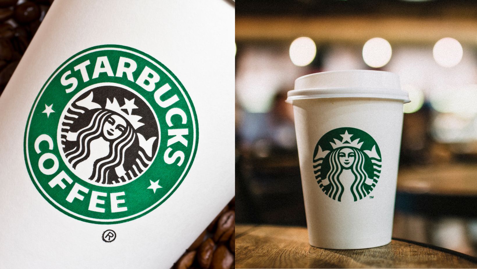 *Image sourced from Canva
3. Nike
Nike is also on the list of brands that have debranded. In fact, some believe that it was the
first to debrand.
So, what did this company do to spark the debranding trend?
It streamlined its logo by removing its name from it and leaving only its signature 'Swoosh' behind.
Since this debranding, the 'Swoosh' logo has become such an integral part of Nike's brand identity that its online company store,
Swoosh.com, was named after it. The brand has also introduced
sportswear with designs that incorporate the word "Swoosh".
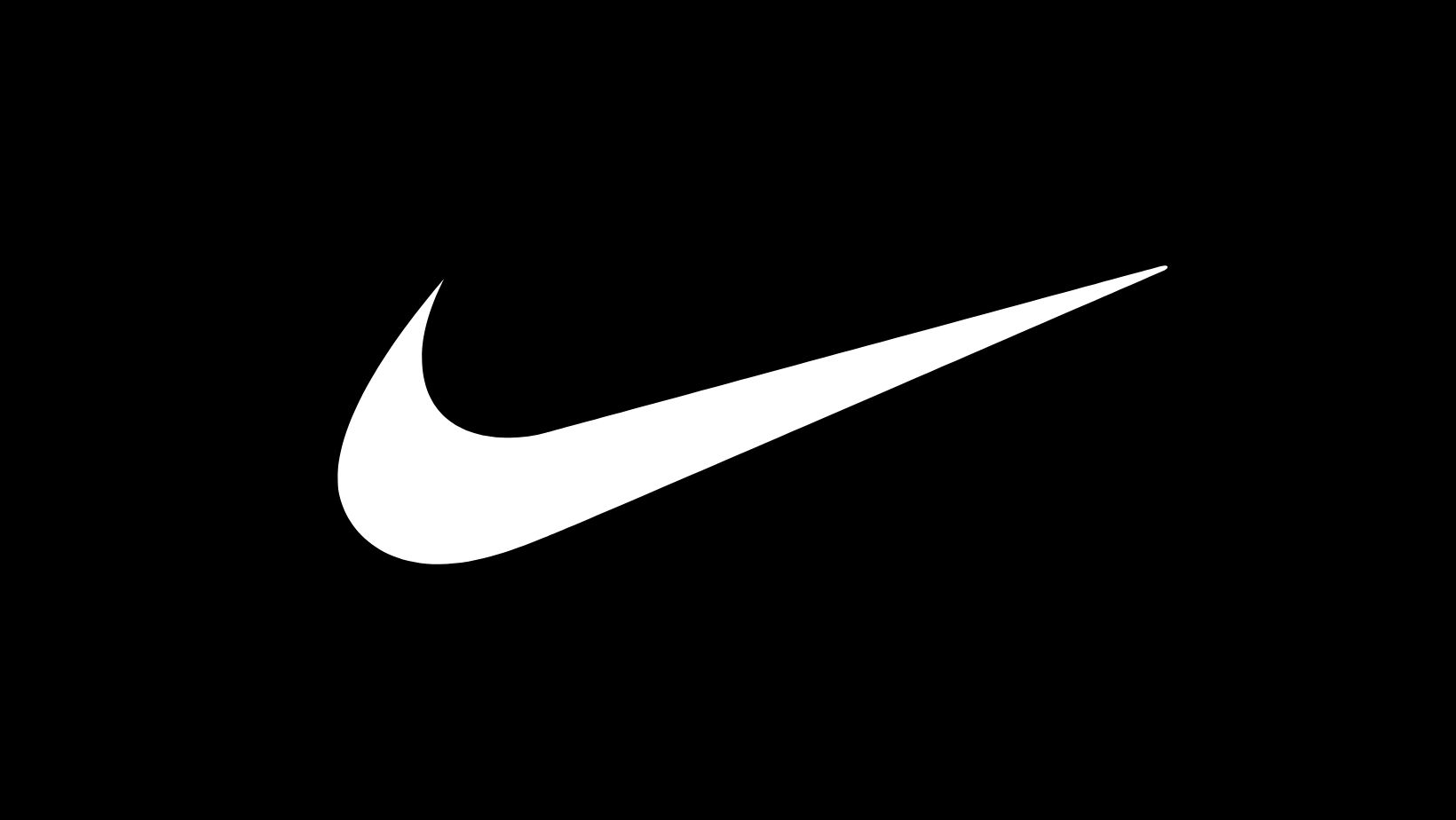 *Image sourced from Canva
4. Warner Bros.
Some of our favourite movies start with the blue and gold shield that we've come to know as the Warner Bros logo. However, in newer movies and on the Warner Bros app, you might have seen that the film production company has modified its famous logo.
According to Warner Bros. CEO
Ann Sarnoff, this change "bring[s] the studio more in line with 21
st-century sensibilities." Therefore, its sleek new design is a perfect example of how debranding is used to modernise a brand's visual identity.
This is also a perfect example of how debranding doesn't
completely alter a brand's visual identity but instead revises it. How so?
Although the logo has been cleaned up and adjusted, it is still highly recognisable as it still employs the shield and "WB" that we are used to. The new and improved shield also uses the
Golden Ratio to ensure that it is more aesthetically pleasing than its bulky predecessor.
5. Saint Laurent
Yves Saint Laurent also began debranding in 2012 under the guidance of its creative director at the time
Hedi Slimane.
The logo evolved from a thin, dainty font with no spaces in between into a bold, all-caps font that is spaced out. This not only makes the logo more
simple and
sleek, but it makes it
scalable — allowing the font to be produced in various sizes without heavily affecting its readability.
Although its shortened name took inspiration from the 1966 line named 'Saint Laurent Rive Gauche' — as opposed to being a debranding technique — we can't deny that its simplification works. This is because the logo appears to be more sophisticated and it is easier to pronounce.
6. Intel
Intel also dabbled with some debranding by refining its logo. Gone is the old blue encircled logo as it was replaced with a simpler image of only the brand's name. Intel also chose to go with a stylish black colour for its font with a nod to its brand's blue in the dot of the 'i'.
This transition mimics the continuous advancements of the tech giant's products and
increasing influence as an improved version of its old logo.
Which one of these debranding examples is your favourite? Let us know in the comments section below.
Want to stay up to date with the latest news? Subscribe to our newsletter.
Still not completely sure what debranding means? Then be sure to read our article, What is debranding in 200 words or less.
*Image courtesy of Canva